


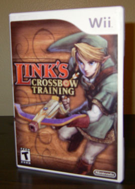
 Back when the Wii first came out, I had posted instructions on PlayWii.com for making a real Wii Sports case, a replacement for the lame cardboard sleeve the game came with. Now I'll do the same for Link's Crossbow Training because I love this game and in my opinion, any Zelda game deserves a proper case. There are a few nice, full cover image that can be found at The Cover Project. Just print it out on the best printer you can find using an 8.5x14 sheet of paper, trim the edges, and stick it in a white DVD case. Nintendo does sell official replacement cases (in packs of 10), but any old white DVD case will do. A couple more pics after the break...

It may not be P.C., but we'll say it anyway. Merry Christmas everyone! In this episode Ray and Tim discuss the Games of Christmas Past, the Consoles of Christmas Present, and the Games of Christmas Yet to Come. Plus all the usual stuff, so check it out!
Well, we've made a few more incremental changes here at 2P START! Nothing as drastic as our last change, but we hope you enjoy it nonetheless. Most of it isn't too noticeable, so I'll list all the changes for you.
The contest page should be fun for everyone. It lists the winners of past Trivia for You! contests and allows 2P START! fans who DON'T listen to the podcast (shame on you!) to have a little fun too. The audio clips for all the contests will be listed and the corresponding answers are hidden so you can guess the song without having the answer right in front of you. There will be more changes coming including an archive for the 2P START! header images we're changing each week, so keep an eye out for them!
Imagine you just popped in Smash Bros. Brawl, and then you press start at the title screen. Well, here's the main menu you would see next:

How do you feel about this?
As a Graphic Designer, I've thought pretty hard about the alignment, the colors, the symbols, the fonts, the white space, and the consistency: and I end up wondering things like this:
• Why is there an X for Group? Is that supposed to mean multiplication?
• Why does the Wi-Fi button look nothing like the other buttons?
• Does this menu really say "Smash Bros?"
• Why do the borders have an uneven and inconsistent thickness?
On the other hand, It also works quite well, and I also end up thinking:
• The buttons must be gigantic so that selection is easy with the Wii Remote.
• The Wi-Fi button looks pretty similar to the logo used on game cases.
• The size of the individual button is determined by its importance.
• Perhaps it will all make a lot more sense once everything's unlocked..?
• Smash Bros. Menus generally reflect the style of the console it's on.
Perhaps I simply need to get used to it. Plus in the long run, is it really going to change what we think of the game itself?

Oh boy, this podcast is certainly different as there is a 'special' guest throughout. That's right, Ray's girlfiend (not a misspelling) Jessica joins us to discuss Mario & Sonic at the Olympic Games. Plus all the usual segments including Trivia for You, Black Doom Award, Suggestion Box, and Comic Talk! (Sorry, it's a little on the long side.)

I saw this ad on joystiq and the slogan really made me laugh: "Make Friends. Share memories. For Free." Tell me something, have you ever paid someone to be your friend? And while it may cost money to go out with your friends, is there some sort of memory-sharing fee I'm not aware of? I think it's time to fire the ad department.
This video was hosted on GameVideos, which no longer exists.
If you listened to the podcast this week, you probably heard Ray talk about the Wii knockoff, the Vii. There was a hilarious commercial for it on YouTube that shows this very clearly. Well, there's one aspect of the Vii that is very different than the Wii. I know it's in Chinese, but you HAVE to watch at least the first 60 seconds of this video. And make sure the sound is on. Really hilarious stuff.


